Visualization
Three data visualizations are immediately available when viewing a set of events on the events screen: frequency histogram, @Elapsed heatmap and trace viewer. Other data visualizations are available for the results of SQL queries.
Frequency Histogram
The frequency histogram shows the number of events over time for the current result set. A label, such as count(*) by 5s, indicates the aggregate function (count) and time grouping (5s) that has been used for the histogram, using Seq's duration literal syntax. A second label shows the number of events in the largest group. Hovering the pointer over a bar displays a tooltip that includes the time and count for that bar.
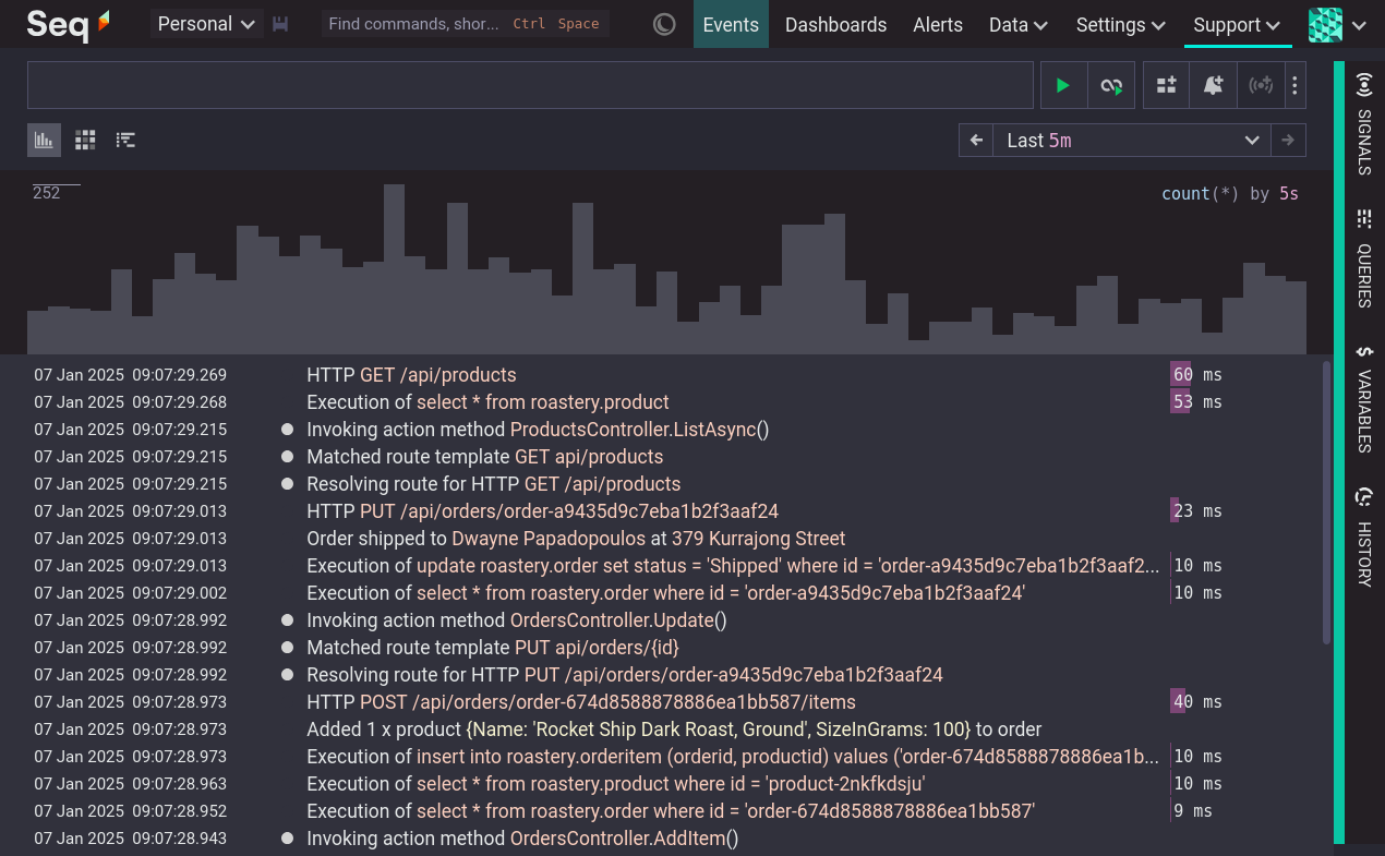
Clicking on one of the histogram bars filters the event list to that time range and re-draws the histogram.
@Elapsed Heatmap
@Elapsed HeatmapThe @Elapsed heatmap shows the distribution of the built-in property @Elapsed over time for the current result set. @Elapsed will be present on events that have a @Start property, such as OpenTelemetry and SerilogTracing spans.
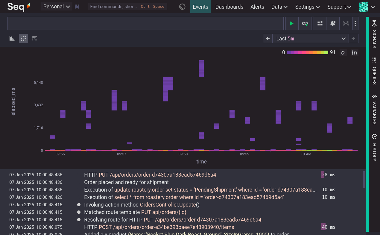
Like the frequency histogram, clicking on a column of the heatmap filters the event list to that time range and re-draws the visualization.
Trace Viewer
When a trace is selected it is displayed in the trace viewer. For more detail see the tracing documentation.
Visualizing Query Results
Seq's SQL-like query language produces tabular results that can be used to produce various data visualizations. When a query is evaluated the results are shown as a table, and the data visualization buttons appear beneath the filter bar.
View as timeseries
The timeseries visualization is available if the rows of the result table each represent an instant in time and include a numeric value. This can be the case if:
- The first column is
@Timestampor - The query is grouped and the last group key is the
timefunction.
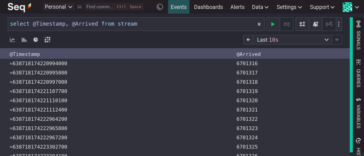
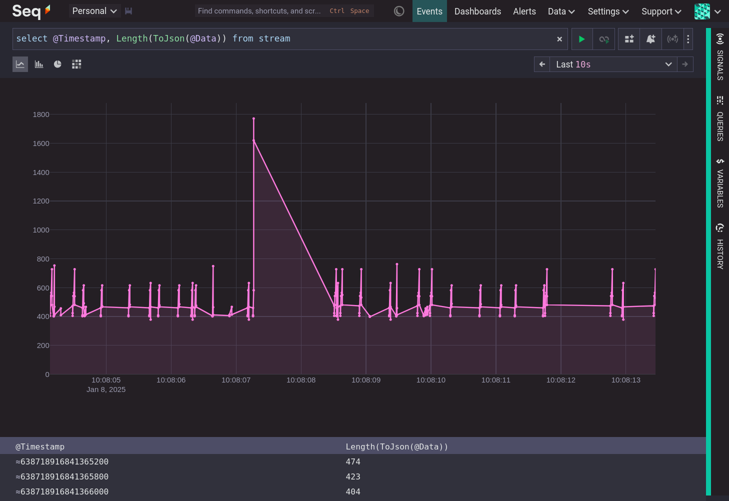
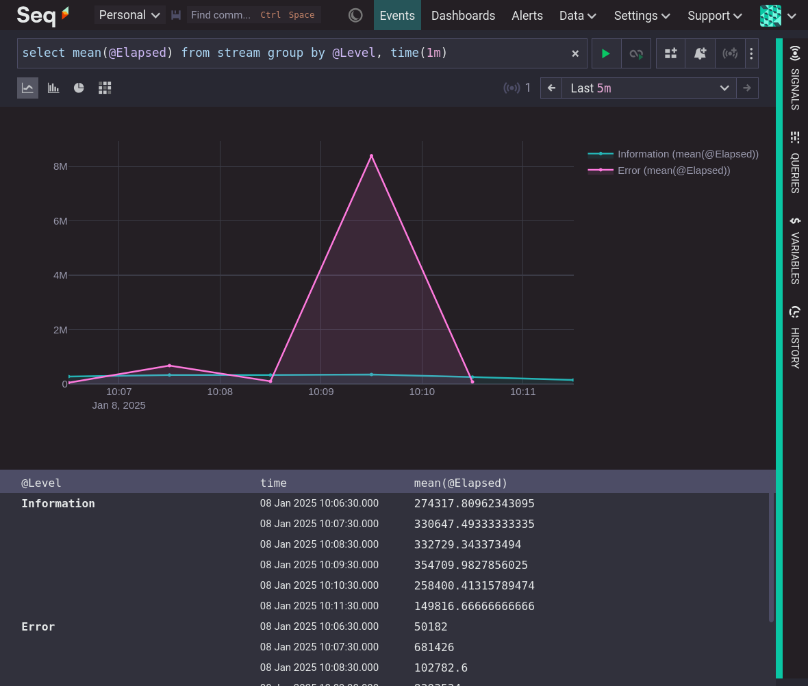
The following image shows the timeseries visualization of a query that includes @Timestamp as the first column. The visualization will include a series for every column in the result but the first.
The other way to visualize a timeseries is to group lastly by time. The visualization will include a series for every value of the first group key.
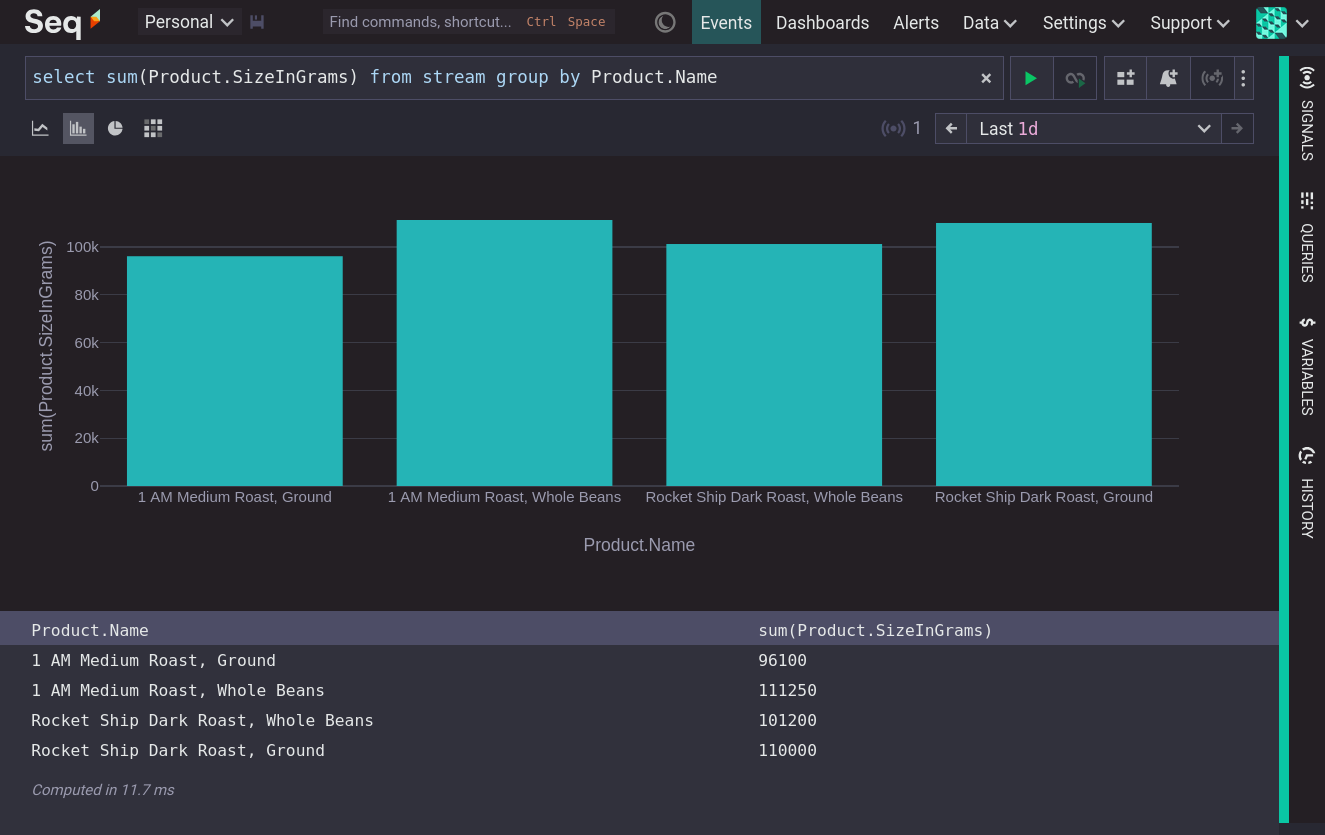
View as bar chart
The bar chart visualization is available for results that have two or three columns, with the rightmost column being numeric. The first column becomes the horizontal axis and the last column becomes the vertical axis.
Bar charts are commonly used to display the aggregate values of groups, such as the query:
select sum(Product.SizeInGrams) from stream group by Product.Name
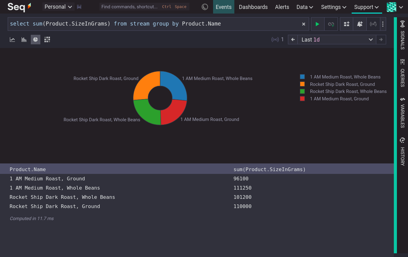
View as pie chart
The pie chart visualization is available when the result table has two columns and the rightmost column is numeric. Like the bar chart it can be used to display aggregate values of groups.
View as heatmap
The heatmap visualization requires a result with three columns and a numeric rightmost column. The first column becomes the horizontal axis. The second column becomes the vertical axis, and the third column becomes encoded as a color intensity.
Heatmaps are commonly used to visualize the distribution of numeric values over time, which can be done with Seq's Bucket function. The following query produces a result which the heatmap can render to show the distribution of @Elapsed values over time:
select count(@Elapsed) from stream
group by time(1m), bucket(@Elapsed)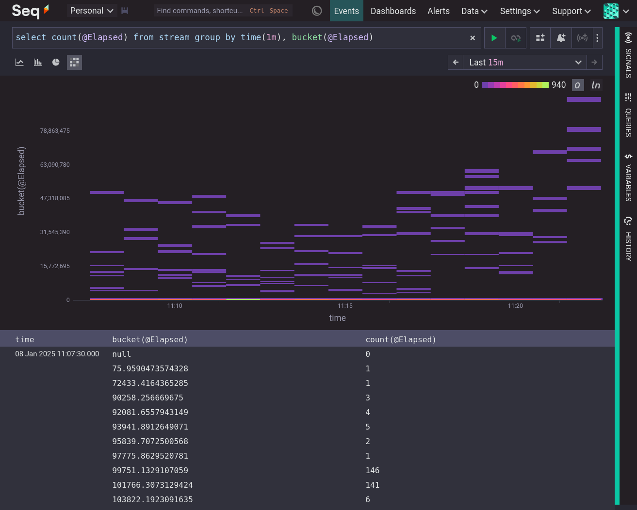
Heatmaps of this form can be produced by selecting Plot Heatmap from the property menu of a numeric property, or from the trace menu, of an expended event on the events screen.
A heatmap may also be used to visualize aggregates of groups over time, such as the query:
select sum(Product.SizeInGrams) from stream group by time(1m), Product.Name
If one of the group keys is time it must be the first group key.
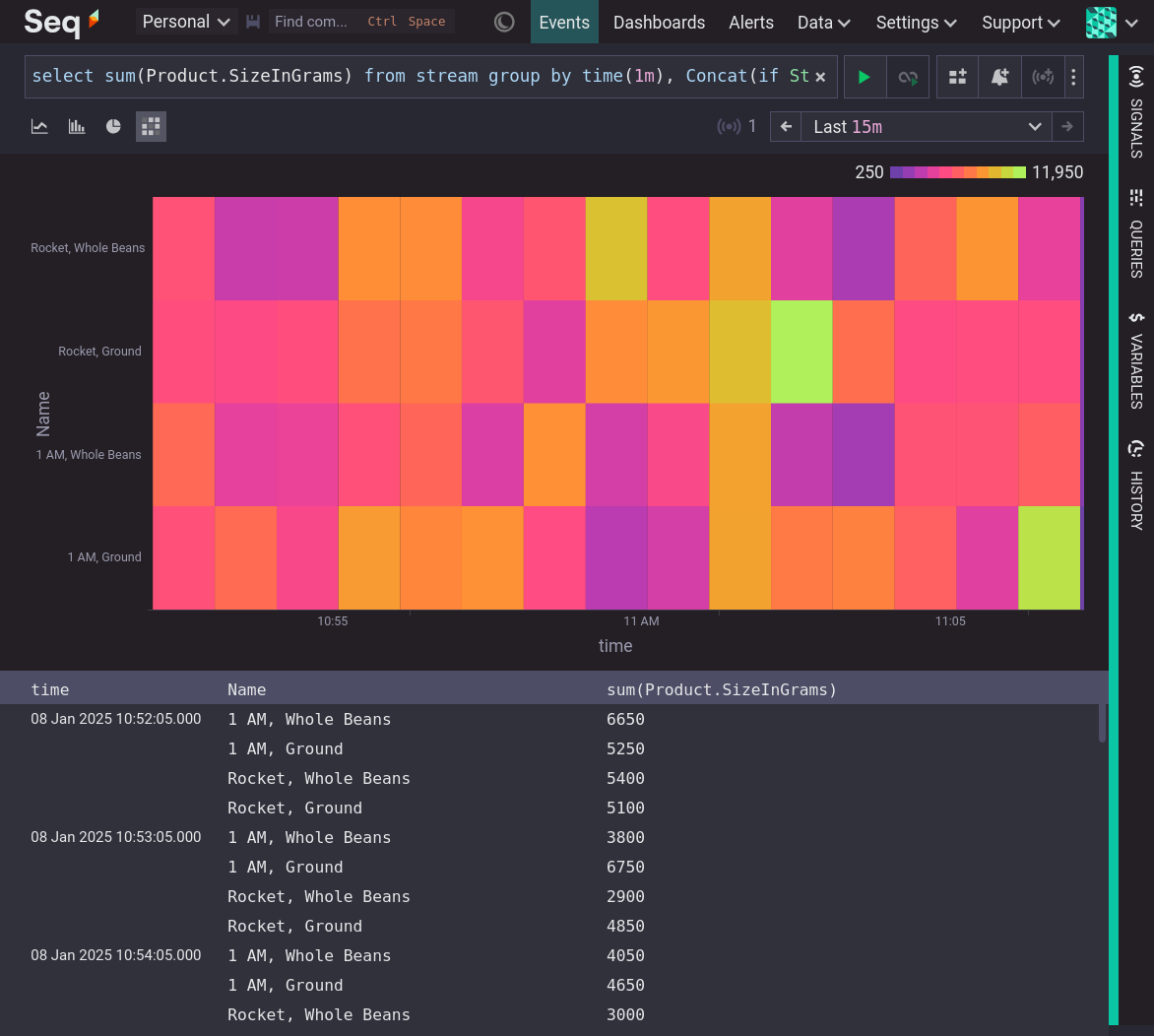
Tooltips over the heatmap show the values for each cell.
'Include Zero' Button
If the vertical axis is displaying bucketed values then the heatmap will have an Include zero button (on by default) that forces the vertical axis to include zero. This may make the relative comparison of values on the vertical axis more intuitive.
'Logarithmic Scale' Button
If the vertical axis is displaying bucketed values, and there are no values less than or equal to zero, then the heatmap will have a Logarithmic scale button (off by default) that renders the vertical axis as a logarithmic scale with the same log base as was used for the Bucket function.
The effect of switching to logarithmic rendering is:
- The vertical size of the buckets is made the same
- The view 'zooms in' on the small values.
Logarithmic rendering is often useful when the heatmap values appear to be clustered around zero.
Updated about 1 month ago